Cartogram and GCPD Tutorial
Contents
Introduction
California is a global hotspot for salamander diversity owing to its climate and geography, including the arboreal salamander Aneides lugubris, which lives in western California. A 2015 study by Reilly et al. used BEAST Drummond et al., 2012) to construct a phylogenetic tree relating mitochondrial DNA from 35 salamanders at 26 locations in California, combined with 43 additional samples associated with 27 locations from GenBank. Using phylogeography, the authors classified individuals into Northern, SF Bay/Sierra Nevada, Santa Cruz, Pinnacles, Central Coast and Southern clades.
In this short tutorial, we illustrate the application of point-based cartograms in GenGIS to the phylogeographic visualization of this dataset.
Loading Data and Changing Visual Properties
The Salamander data consists of a map (Cali.tiff), location data (Aneides_Locations_Filtered.csv) and a phylogenetic tree (Aneides_Filtered.tre). The zip archive containing these files can be found *here.
For basic information on using the GenGIS interface and loading data please see the Banza Katydid Tutorial.
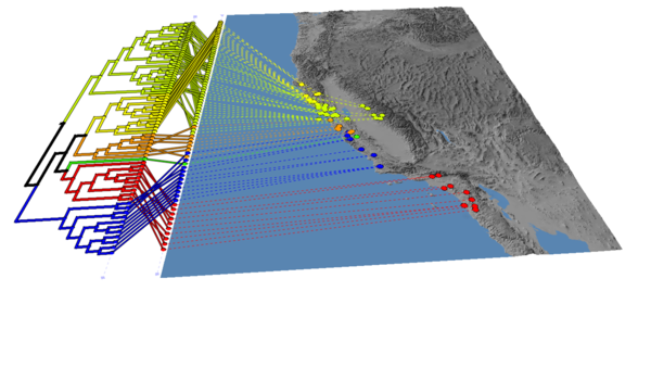
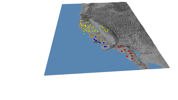
To recreate the image below, do the following steps in order. Note that the aesthetic changes (colours, vertical exaggeration) are optional, and you will get the same cartograms no matter what.
(1) Load the "Cali.tif" map
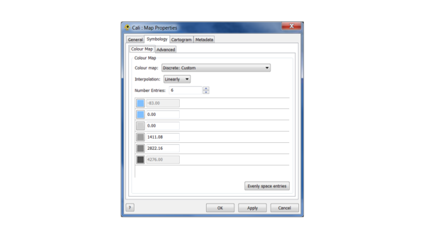
(2) Change the map colours according to the following scheme:
(3) Change the vertical exaggeration to 5.
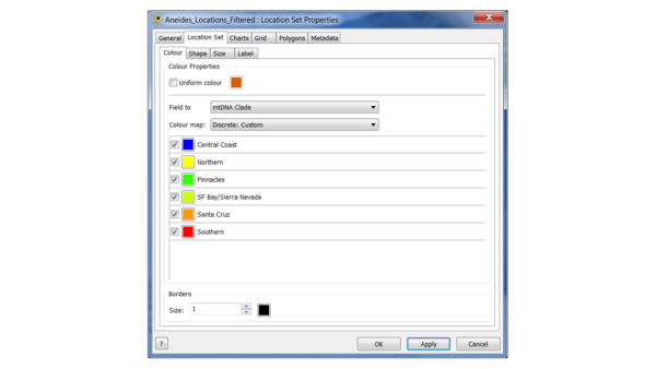
(4) Load the location file, and edit the colours as follows:
This is the "Continuous: Scientific" colour scale, with the Northern clade set to yellow to increase the contrast.
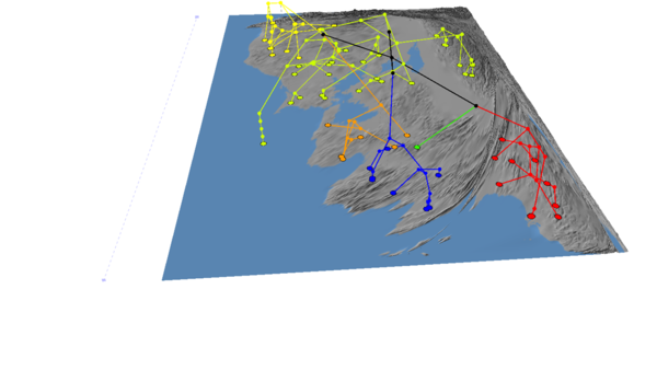
(5) Load the tree, and choose "propagate discrete colours", set the default colour to black, and change the line thickness to 5 in the Properties menu
You should end up with an image that looks like this:
Creating Cartograms
In this section we will create cartograms based on the location density and phylogenetic information in our data.
Location density
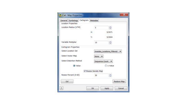
By default the count of samples at each location is used to transform the map, which defaults to one per location if no Sequence file is loaded. To create a cartogram right click the Map in the menu under the "Layers" tab and select the Cartogram tab from the Properties menu.
Let's go with 10 and 10 for location radius and variable multiplier now. Let's also choose "Resize Density Map" at 50% to increase the speed of the procedure. The percentage controls the decrease when the map is resized, with 60% as the maximum value (in practice, values over 60% give cartograms that are unusable). In general, the larger the values of location radius and variable multiplier, the more pronounced the effect of resizing will be, and the points will track the map less well.
Click "Go!" to create the cartogram. Note that "Apply" has no effect in this menu.
If we hide the tree, then the cartogram should look like this:
To fine tune the cartogram two parameters can be adjusted: Location Radius and Variable Multiplier. The Location Radius adjusts the size of the grid cells the map is divided into when the cartogram is created, while the Variable Multiplier amplifies the value of populated grid cells by a X times multiple of the stored value.
You can click "Restore Map" in the cartogram tab to reset the map to its original state. Now try setting the location radius to 100 and re-running.
Phylogenetic transformations using the GCPD
GenGIS can use data besides location count to adjust the map. Any quantitative value in the location file can be used for this purpose, but we have developed the Geographically Coupled Phylogenetic Distance (GCPD) to adjust the distortion effects based on phylogenetic diversity. Briefly, the GCPD for a location is computed by considering its diversity relative to the closest other locations in the map.
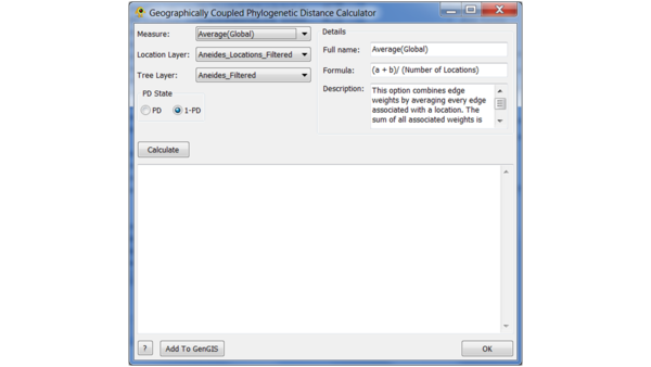
To compute the GCPD, go to the Plugins menu and select the GCPD option.
In this window, you can choose the method for aggregating diversity across pairs of sites, the location and tree layer (which are fixed in our case, since they have only one of each), and the choice whether to use phylogenetic diversity (PD) or 1 - PD to define the distance. Choosing PD will tend to assign large values to sites whose neighbours are phylogenetically distinct, whereas 1 - PD will do the opposite.
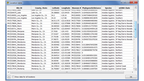
Click "Calculate" to compute the GCPD for each point. Once the values have been calculated, select "Add to GenGIS" to add them as an additional location attribute. You can use the Location table viewer plugin to verify that it has been added:
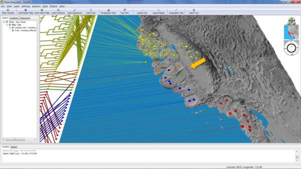
Now we're ready to generate the cartogram as before. This time, select "PhylogeneticDistance" from the cartogram menu, and hit "Go!". The following example was generated with a location radius of 5 and a variable multiplier of 30:
The arrow shows an area of high phylogenetic diversity - three different clades in one small region of the map - that has been disproportionately been expanded because of the GCPD.
Contact Information
We encourage you to send us suggestions for new features. GenGIS is in active development and we are interested in discussing all potential applications of this software. Suggestions, comments, and bug reports can be sent to Rob Beiko (beiko@cs.dal.ca). If reporting a bug, please provide as much information as possible and, if possible, a simplified version of the data set which causes the bug. This will allow us to quickly resolve the issue.
